Android enterprise
REBRANDING | COPYWRITING | BRAND TONE | CONTENT & UX STRATEGY
Android’s recent global rebranding involved more than just a new color palette and revised mascot and word mark.
ANDROID’S GLOBAL REBRANDING
Android has had a fairly consistent look over the last decade, but as the operating system grew to over 2 billion users worldwide, Google decided it needed to be more inclusive.
The brand mascot was simplified, colors were revisited—for example, people with color blindness can’t interpret certain shades of green—and the brand’s tasty treat version names were sometimes unheard of in parts of the world. Since Android is a global brand, it was important that it represented a truly global audience.
All these points also applied to the brand’s B2B segment, Android Enterprise. This is the part of the rebranding project I worked on.
The new brand voice is friendlier and takes some complex technology and explains it in easy-to-understand language. Perfect for our dual audience of SMBs (Small to Medium Businesses) and ITDMs (IT Decision Makers), making the site accessible to everyone who browses it.
As the copy lead on the project, I created narrative structures which helped both develop and define the story that needed to be told on each page.
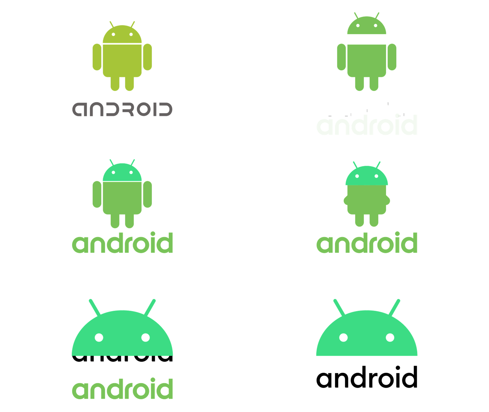
The Android team developed a palette of new brand colors to go along with the new Android green, for various elements like visual assets and packaging. Andy the android was simplified and made a new shade of green, and the word mark was tweaked and will be used in conjunction with Andy in every instance.
Agency: Huge Brooklyn
Copy Lead: Ethan Jameson
Designers: Alejandra Molano, Chris Cruz, Elushika Weerakoon
Group Design Director: Diego Nicolau
Experience Design Director: Brad Donnelley
See the whole site: https://www.android.com/enterprise/


